
Alert Hub monthly reports have been available as structured JSON and generated Markdown. Those formats are useful for machines, analysis and archival work, but neither is an especially convenient way to inspect a large report in a browser.
The CAP Aggregator now provides a dedicated HTML view. The first published example covers July 2025 to June 2026 and can be opened in the reporting application.
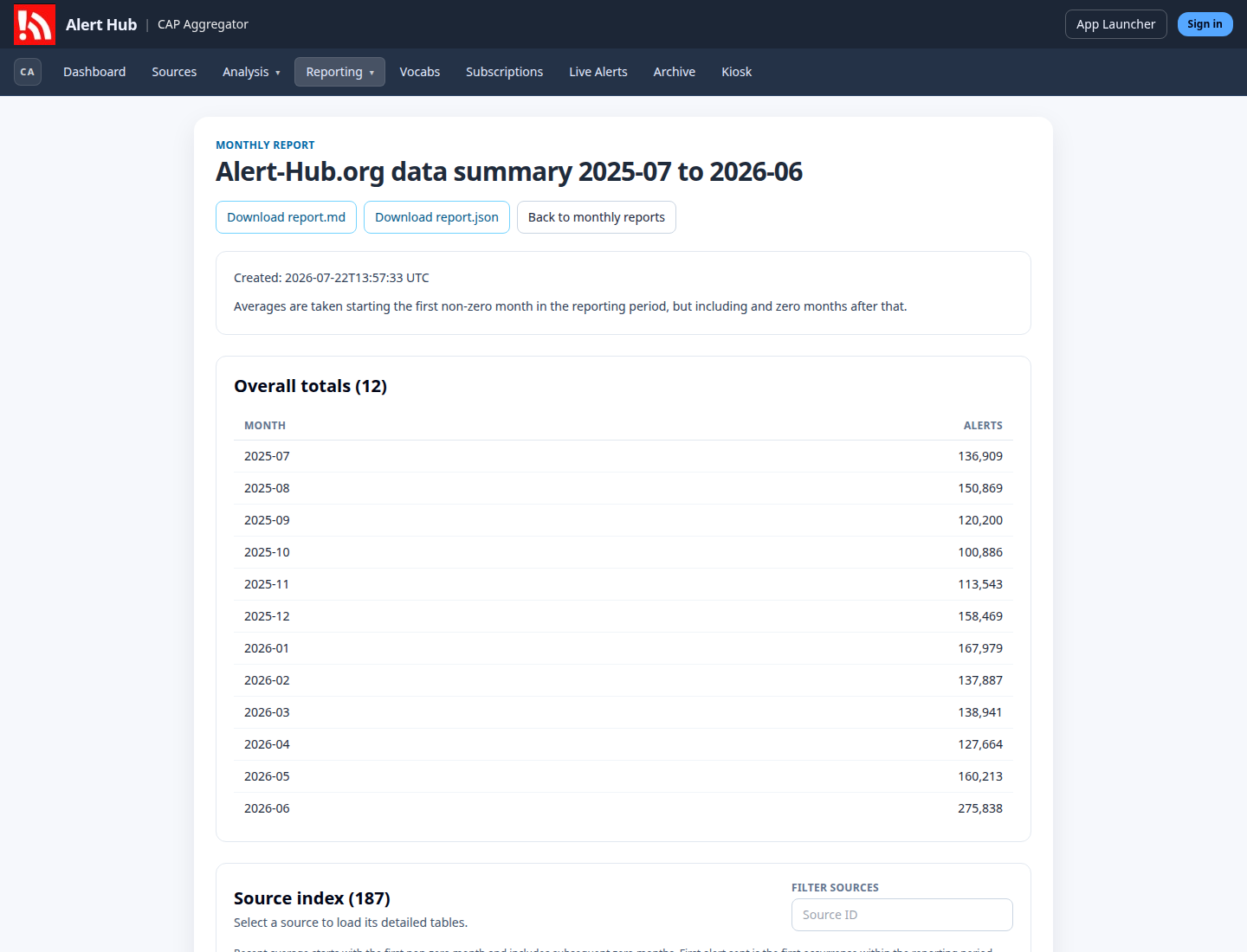
One report, three presentations
The HTML page does not parse the Markdown back into application data. It fetches the report’s canonical JSON and renders that structure directly. This keeps the responsibilities clear:
- HTML provides an interactive browser view
- Markdown provides a portable, human-readable document
- JSON preserves the structured report for software and further analysis
The Download report.md and Download report.json controls are now available at the top of the HTML view. Both retrieve the already-published report representation; they do not regenerate the report in the browser.
This arrangement also avoids maintaining a second report-calculation path in the frontend. Report production remains a backend responsibility. The application only presents the finalised result.
From the reporting window to individual sources
The overview lists totals for each of the twelve months. In this report the monthly counts sum to 1,789,398 alerts. June 2026 has 275,838 alerts. These are observations from this finalised reporting period, not a live operational counter.
Below the totals is an index of the 187 sources represented in the report. Each row shows:
- source identifier
- first alert sent during the reporting period
- recent monthly average
- total alerts in the period
- alerts without polygon geometry
The index can be filtered by source identifier. It is held in a bounded scrolling area with a fixed heading, so a large source list does not make the surrounding report difficult to navigate.
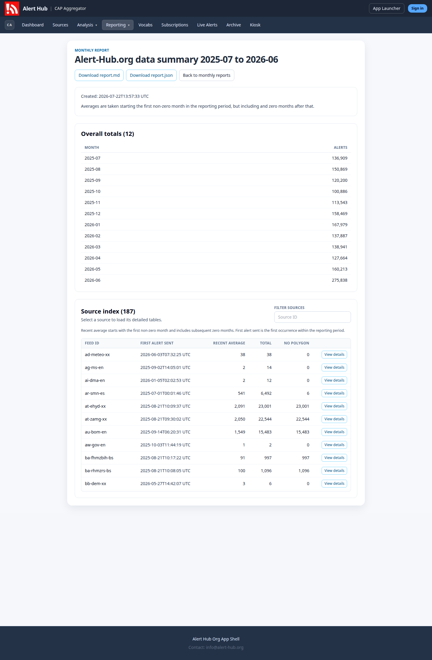
Selecting View details adds the chosen source’s analysis below the index. The detail view reports its full-period and recent averages, explains the averaging window, and presents distributions for:
- publication frequency
- tags and flags
- CAP severity values
- CAP message types
- composite analysis categories
- event types used during the period
Where the report contains a sample link, the view also links to the latest example alert. The detail tables are only added after a source is selected. That keeps the initial document smaller than rendering every source’s full analysis at once.
What the report is for
The page is intended to make a finalised reporting snapshot easier to inspect. It can help an operator compare source activity, identify missing polygon geometry, review CAP value distributions and follow an example alert without first processing the JSON locally.
The downloadable forms serve different follow-on uses. Markdown can be read, quoted or stored with ordinary documents. JSON is suited to reproducible analysis and other software. The HTML presentation supplies navigation and selective detail without replacing either format.
This is a presentation change rather than a change to the reporting calculations. The current view exposes the data already present in the finalised report and gives each representation an explicit role.